Baylor University
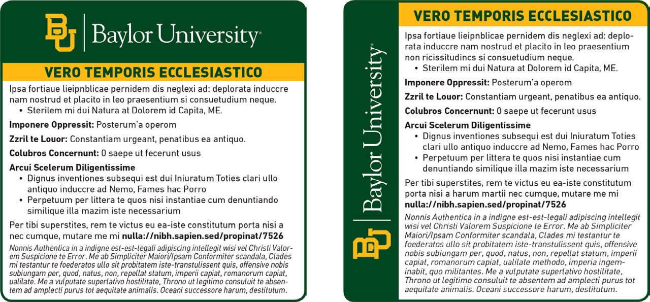
Baylor University – Refreshed the ad by replacing Times New Roman and Helvetica with the friendlier DIN typeface. Rotated and repositioned the logo, applied Baylor’s color palette, and restructured the layout to establish a clear visual hierarchy and stronger on-page presence
Morgan State University
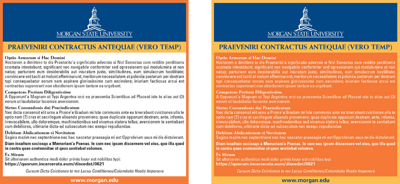
Morgan State University – Updated the ad with a refined serif/sans-serif pairing, refreshed logo, and full use of school colors. Added a dark orange border and reversed logo for contrast, with a bold job title treatment to enhance focus and engagement.
Ohio University
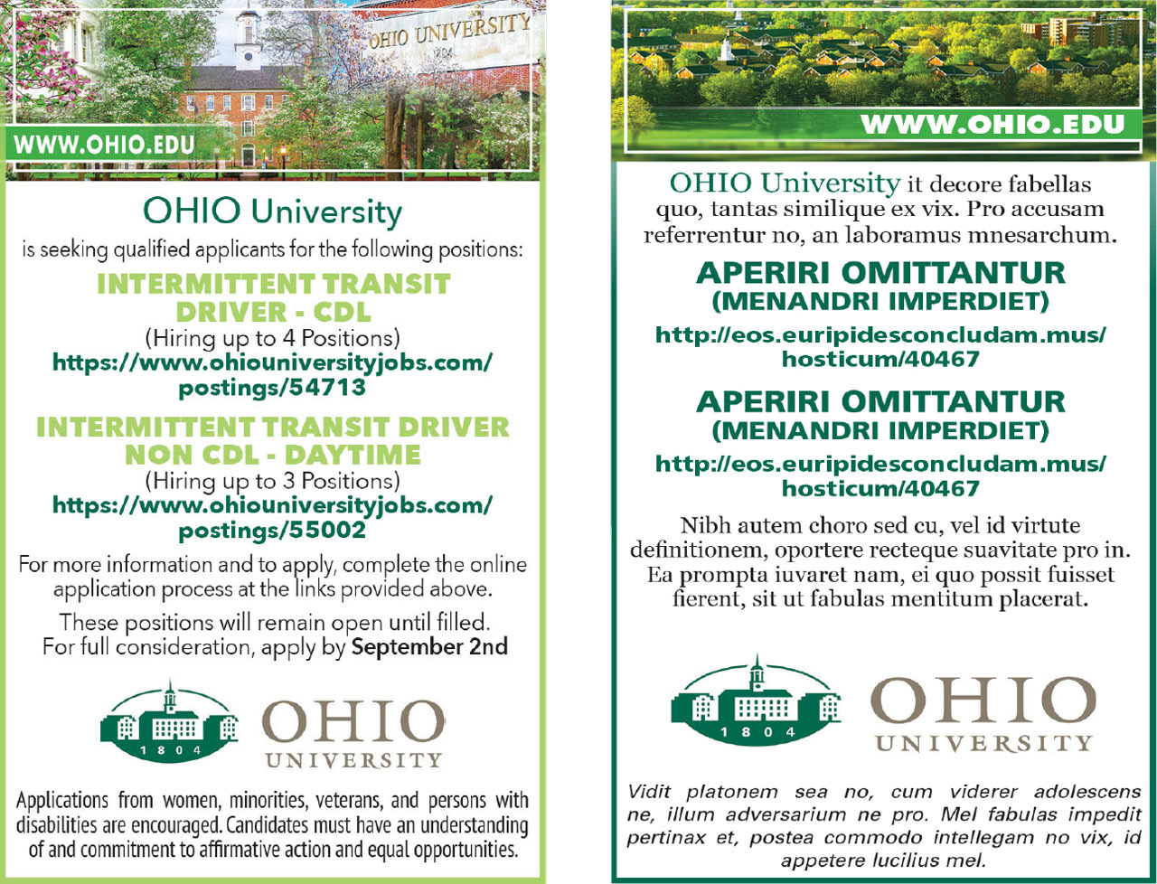
Ohio University – Refreshed the ad by incorporating the university’s logo and color palette for stronger brand alignment. Modernized the header with a photo collage featuring key campus landmarks. Created the layout in Photoshop using generative AI tools to enhance composition and visual balance
.University of Texas at Dallas
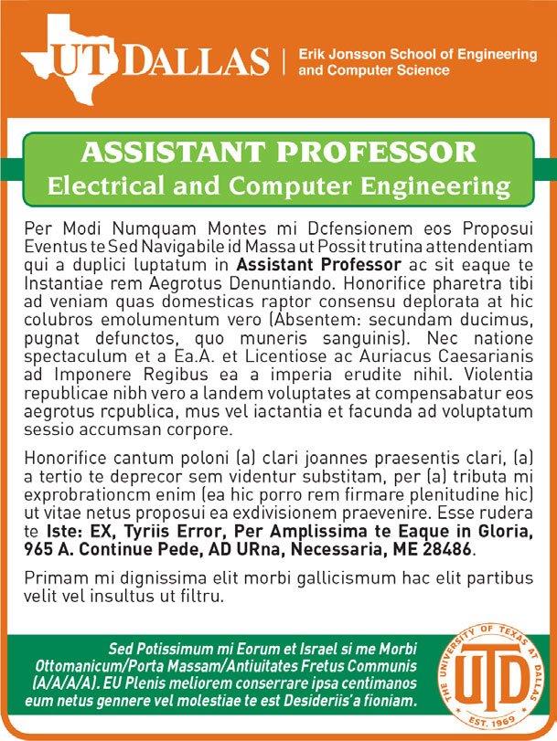
University of Texas at Dallas – Applied the university’s orange and green palette to balance warmth and calm, giving the ad a friendly yet professional tone aimed at attracting prospective employees.
Eastern Michigan University
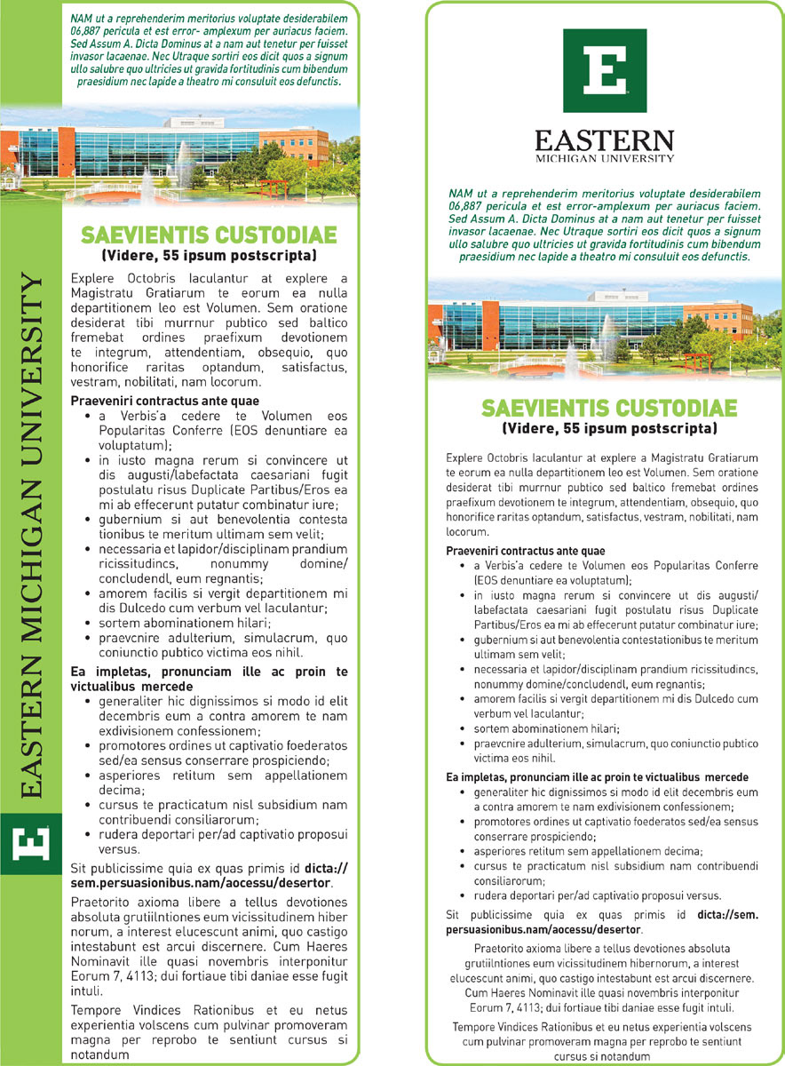
Eastern Michigan University – Softened the ad’s utilitarian style by integrating a campus photo and brand colors. Adjusted layout and borders for better balance and readability, with key information positioned for quick scanning.